All three of this week's illustrations are from graphic designer Patrik Svensson. He's known for his minimalist style and work with movie posters. Each of the following illustrations have multiple layers of meaning, which are found only after closer inspection of the image.
The first piece, Prisoners, is simple in the two-color, black-and-white design. The offset arrangement of the zebra draws our eye toward it. The tiny figure on the zebra's nose stands out by utilizing the Rule of Thirds. I often wonder, as this image implies, if zoos are more like prisons.
The second piece we'll look at is called Mozart, appropriately so. With clever use of negative space, the image of Mozart is revealed. Fun details, like music notes for buttons, help the viewer to piece together the image from the missing pieces, and they also add a good use of flair.
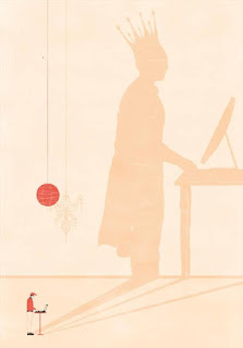
The third piece, Social Media, pokes fun at our current culture. More often than not, people take on a different, mightier persona when online. I enjoy the visual created from the giant shadow contrasting the small figure int he left corner. While I can't see right away that he's on a computer, I can tell that he's plain-dressed. The shadow in the background helps me fill in that he's on a computer. A further layer reveals a chandelier and crown in the shadow. The shadow being projected helps us think about how the small figure is projecting this image through the computer. Overall, the imagery and the rendering of the illustration are great.


